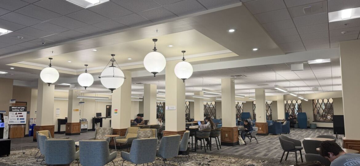
Students work on their computers inside a study space on the second floor of CU Boulder’s Norlin Library on Oct. 29, 2026. (Photo by Tatum France-Kelly)
Can color influence our behavior?
Yellow is happiness, red is anger and blue is sadness. Most can agree on the emotions that colors evoke, and the meaning society has attributed to them. But where do these meanings come from?
In a study of 74 English-speaking adults, 76% associated red with anger, 60% associated green with envy and 57% associated blue with sadness.
Color psychology studies how colors influence mood and behavior. Observational research on the relationship between color and emotion suggests that blue may have a stress relieving effect, while red may have an impact on performance in competitive settings. Color affects how individuals move through spaces and perceive the world.
Most practical applications of color psychology are found in marketing and design. Color choice is used to reinforce brand identity and influence consumers. Logos for fast food chains overwhelmingly use red and yellow, and it’s not only because of the condiments they carry.
“Every time I see red and yellow when I’m out, I get kind of hungry because it reminds me of like In and Out,” said Samantha Dudash, a sophomore at the University of Colorado Boulder.
Red is often used to represent strength, love and anger. Yellow is associated with joy and energy. It’s also believed that both colors may evoke feelings of hunger, though research is limited. Together, they make a bright and eye-catching logo, which may entice consumers into buying a meal from an advertising restaurant.
“Blue is usually associated with truth and trust and honesty,” said Diane Elliston, an professor of advertising, public relations and design at CU Boulder. “If you look out in the world at banks and financial institutions, a lot of them use blue in their branding.”
Interior design is another area where color psychology comes into play.
“If you go into a spa and it’s bright orange or bright red in there,” Elliston said. “You might not be very relaxed.”
Research suggests that colors have the ability to enhance an individual’s attention level. Warm colors may have a greater impact on attention compared to cool colors. This enhanced attention can transfer to increase memory and recall.
When constructing a space intended for focus, designers consider how the colors, textures and decorations may influence the perception of those inside.
“When you look at library spaces in the US, a lot of them have dark woods,” Elliston said. “They’re very quiet and calming in that way.”
How color and interior design plays into people’s emotions and behavior can even be seen at CU Boulder.
The Center for Academic Success and Engagement building is white and has various, large windows to make the space bright. Meanwhile, Norlin Library has traditional warm, dark woods throughout.
Many of the buildings on campus include colored murals or features, intentionally chosen to make the interior more appealing or friendly.
Students may choose certain buildings to study in, based on location and interior design.
“I like to study at Hellems, the lighting is nice and there’s plenty of seating,” said Hannah Stout, a psychology student at CU Boulder.
Further consideration of color psychology may improve student’s abilities to study and improve comfortability on campus.
“Design should be inclusive and always based on audiences,” said Parisa Tashakori, a graphic designer. “When we design for the public, we should definitely use some rules to make it inclusive.”